The exhibition had a lot more guests than I thought it would! (I also thought I'd be one of the few who actually invited their parents...)
Sadly, I was an idiot and forgot my camera... But it was fun to show my parents what we've been doing all semester. They really seemed to enjoy the clay characters the best. ^_^
I think my baby nephew enjoyed the show, too, but not for the art... He got a kick out of flirting with all the ladies! :D
(BTW, the look on my dad's (who could usually be described as a proper gentleman...) face when he saw Brian's "washroom" video, and the "orgy under the blanket" video was HILARIOUS!! XD )
Monday, December 13, 2010
Stencil


Took me a lot of tries to come up with something that looked OK, so by the time I did, my stencil looked like CRAP!!! :^(
AND THEN PAINT FROM THE STENCIL GOT ONTO MY CARDBOARD. UGH.


Sunday, December 12, 2010
Mark Making Device
My Hair!! :D No, actually not ":D" .... It was a pain to clean out of my hair, and I had to have a friend help me get all the braids out... :/ Oh, and never try the "windmill" with clothespins tied to the end of your hair. Just a heads-up.
I'm not sure I actually liked how my marks came out, since they weren't anywhere near as bold as other people's.
 |
| BTW, Thanks Meredith; I stole the picture from you! |
Sontag Writing Assignment

purpose of photo: A picture of my friend as he helps me babysit my nephew. Kaden (nephew) really liked him, and they even had matching hair-dos! They were just too cute together. Meant as a cute picture to help me keep track of my nephew's growth, and to have something of my friend who is being deployed soon.
emotional connection: One of my closer friends, along with my nephew. Photo makes me smile every time I look at it.
context intent: Meant for me and my close relatives to view.

Emotional Connection: Milah took the photo of me, so we were actually joking around although she says I "look creepy".
Context Intent: Meant to document work on the Inflatable project, or just to enjoy by friends.

Purpose of photo: Meant to be funny, and no other reason whatsoever.
Emotional Connection: No emotional connection, except for maybe to pity the rat?
Context Intent: Meant to be viewed by whoever finds this amusing, as often as they want.


(3D) Clay Characters
I started off trying to make something completely different and complicated, but when I realized that there was really no way for me to make that idea work with what I had, I trashed it and grabbed the first thing I saw off my desk: a face mask, left over from when we spray painted the inflatable. So, taking a giant wad of newspaper, I made a short, fat creature with a giant mouth. The mask made me think of crazy doctors (especially with Ryan's Zomb-bear just across the table), so i gave him a mean expression and put the mask across his face to wear.
I had been hoping that people would realize that you could pull the mask away from his face to see that he was laughing at you.... But i guess most people didn't want to touch.
I wasn't sure how to fix that for the exhibition, until Ryan came along and suggested that the creature simply wear the mask as a hat. Thanks, Ryan! ^w^
As for his name.... The first thing that popped into my head: Mark the Mask.
 |
| He's a red neck, don't make fun of him for only having one "tooth"! |
 |
| Looks a bit more like a mad scientist now... |
I wasn't sure how to fix that for the exhibition, until Ryan came along and suggested that the creature simply wear the mask as a hat. Thanks, Ryan! ^w^
As for his name.... The first thing that popped into my head: Mark the Mask.
Thursday, December 9, 2010
"That's Pretty Good for a Girl"
Essential [ Identity ]
Activist Performance
Sisterhood
Distinguish Art of Men vs Women
- personal
- body
- sexuality
- iconography
- affirm female attributes
Activist Performance
Sisterhood
Distinguish Art of Men vs Women
12/3 Lecture (w00t last one)
=D Yay, last lecture. Now, if only it will start.... Oh, here we go. Wait, no, another movie... And this one has music! Yay... Oh, ok, his name is Jackson Pollock. Made them 60 years ago...
Jackson Pollock was the epitome of American modern art. "Jack the Dripper"
JP : art :: B-12 : military Abstract Expressionism painting 1950 - 1980's
"Action Painting"
Pollock had HUGE paintings. He would lay the canvas on the floor and walk around then. He said that painting wasn't about thinking, it was about being.
Abstract Expressionism only took place in a very narrow window of time. Very dogmatic, debatable.
Cy Twombly (<--- ugh)
totally opposite of Jackson Pollock.
Bryce Martin (is that right...?)
Ultra-Minimalist. You can do anything in art. Did ultra-minimalist paintings in one part of career, and color abstract loopy things in another part.
...
Dude. Morris Lewis' veils of paint look awesome. He used acrylic paint, which was invented around this time... It wasn't believed to be good for painting.
The Painted Word
Author: Tom Wolfe
Satirist, makes fun of art world.
Pop Art
Andy Warhol
Marcel Duchamp
Monday, October 25, 2010
Paint Swatches Online
http://kuler.adobe.com/#myKuler/themes
Not sure if this link will work, but...
Not sure if this link will work, but...
Tuesday, October 5, 2010


Human Composition Planning
Teammates: Dana, Lauren, Ryan, Josh, and Milah
Using: Dots
White space:
- white sheet - white wall
- butcher paper - white shirts
- white posterboard - sky
- white gravel - white floor
- white table - black background w/ negatives
Dots:
- black paper cut outs - black clothing
- top of heads - black shirt
- shadows - white dots w/ negatives (flashlights?)
- bubble wrap - jellyfish
- eight balls - bouncy balls
Compositions:
Ryan-- Mickey Mouse, Spiral
Cara-- Snowmen, Proximity
Lauren-- Footsteps, That One With The Dots
Milah-- Oh Noes!, That Other One With The Dots
Dana-- Huh?, Similar
Josh-- Continuance, Closure
Materials:
Sheets (D), Flashlights (R, C, L, M, D, J), Black Clothing (R, C, L, M, D, J), Camera, Craft Paper (R), Black Hats (C, L), Face Paint (L), Black Fingernail Polish (L), Bubblewrap (J), Double-sided Tape (L), TAPE (R, C, L, M, D, J), Tripod (D)
3D Texture Wall Composition

My teammates decided that I could have done a lot better on this than I did. As far as the dots themselves go, I could have showed a lot more progression in their elevation. They should have been crafted a little bit neater- perhaps a film canister for the large one would be better to use? The continuance in the dots is good, however someone did comment that maybe it would have been better if, rather than having the distance between each dot relatively the same, the distance between each dot was also a progressive thing. The similarity in size was good.
As for the texture background, the team decided that it was not the best background to use. The text was too haphazard, and some areas pulled away from itself, creating a distraction. The title was also distracting. They would have preferred a background that followed the path more, such as my large text background or sloped one.
The presentation, however, was neat, if a slight bit crooked.


PLayful vs. Periodic Critique

My group decided that both my compositions were very obvious, and easy to tell which was periodic and which was playful. The meaning of both was very successful.
My playful composition, they said, had closure and was asymmetrical. The fact that it was off center worked well with the frame, and that it looked like the were really sitting on the frame. The positive/negative space was off balance, but that was ok.
As for my periodic, it had symmetry, and was symmetrical. It was centered well, and was clean. I do, however, need to fix the marker a little because there was a small area where the space was uneven.
Sunday, September 19, 2010
Sep 15 lecture
POST MODERNISM (1979) ---> when it all went to hell
pluralism of viewpoints
shift from a dialog taking place in person (in NY or Paris) to a mediated dialog through art fairs, media, etc.
MODERNISM
shock of the new rapid progression of styles
transgressive - opposition to mainstream society (avant-garde)
rejection of the past
colonial view of non-European cultures
IMPRESSIONISM MONET!!
POST IMPRESSIONISM "Art consists of inventing, not copying" -Fernand Leger
FAUVES
CUBISM
FUTURISM Italy
CONSTRUCTIONISM Russia
EXPRESSIONISM Germany
DE STIJL Holland
Sep 10 Lecture Summary
Creativity is...
curiosity maladjusted
Playful sensitive productive make an actual attempt
original flexible
organized accidents? analytical fluent language visual written body sound process
adaptable emotional aware empathetic
"without craft, it will escape"
Blocks: Physical Intellectual mechanical thinking Emotional fear of failing
Environmental Expressive Cultural taboo, rules: what art should be,
playfulness is for children, fear
Devise a Plan!!!!
what language? put to other uses. adapt/modify. magnify. minify. substitute. rearrange. reverse. combine.
Inspiration!!!
dreams. imagine. incubate. display. organize. list. dictionary. thesaurus. associate. classify. exemplify. compare. differ. manipulate. transfer. recycle.
curiosity maladjusted
Playful sensitive productive make an actual attempt
original flexible
organized accidents? analytical fluent language visual written body sound process
adaptable emotional aware empathetic
Perception - ability to see relevant differences, see beyondPut whole self into work.
"without craft, it will escape"
Blocks: Physical Intellectual mechanical thinking Emotional fear of failing
Environmental Expressive Cultural taboo, rules: what art should be,
playfulness is for children, fear
Devise a Plan!!!!
what language? put to other uses. adapt/modify. magnify. minify. substitute. rearrange. reverse. combine.
Inspiration!!!
dreams. imagine. incubate. display. organize. list. dictionary. thesaurus. associate. classify. exemplify. compare. differ. manipulate. transfer. recycle.
Playful vs. Periodic top eight
These were fun, but it was a little hard to try to come up with something original...
 |
| made with dying sharpie... R.I.P. , my loyal friend.... |
I really could have made these a little neater, but I wanted to save my new prismacolor markers for the final drafts. Looking at them now, I realize that there was more overlapping than anything else, but it's ok.
Periodic:
Top Left - two cropped large black squares interact by union, while a white square overlaps both of them. I get the black form in the middle with a mix of intersection and interpenetration.
Top Right - Two cropped black squares are on each side, with a white square between them. The design in the middle of the white square is a combination of overlapping, intersection, and subtraction.
Bottom Left - a black square touches the edges of the frame, a white square overlaps that, which is also overlapped by another black square, etc, etc.
Bottom Right - three black squares are detached from one another.
Playful:
Top Left - a black square has a white square subtracted from it, and is overlapped by a series of growing black squares.
Top Right - several black squares overlap each other messily.
Bottom Left - several black squares are touching, stacked up one on top of the other.
Bottom Right - One large black square is over lapped by a form of several smaller black squares that are united, while a small square is detached from the rest.
Cardboard Progress 2: "I am starting to dislike this project"
Title says it all.
 |
| the second piece had to be braced on the inside in several places to keep shape |
 |
| Used paper to act as hinge, but its too floppy.... |
 |
| ... I need it to stay open, like this. |
So, I have the claw, now I need to make the elbow and put it on. And I'm probably going to have to brace the claw so it stays where I need it. So much for the moveable claw theory.
Cardboard Progress; "A little harder than I expected"
Ok, maybe i would have preferred the gum-thingies.

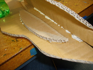


After a LONG day of waiting for glue to dry... I have the main part of the claw pieced together! TA DAH! ... And yes, in case you noticed, I wound up making the right claw instead of the original left one... OOPS.....
This is a bit more difficult then I had intended t to be, but at least I haven't had to trash it yet. While I managed to measure everything out to the exact measurements (hooray for good luck), still, the pieces aren't fitting together perfectly. And... there's something printed on the outside of the crab. Oops. Again. However, they are fitting together well enough to not worry too much about it.
Subscribe to:
Posts (Atom)