POST MODERNISM (1979) ---> when it all went to hell
pluralism of viewpoints
shift from a dialog taking place in person (in NY or Paris) to a mediated dialog through art fairs, media, etc.
MODERNISM
shock of the new rapid progression of styles
transgressive - opposition to mainstream society (avant-garde)
rejection of the past
colonial view of non-European cultures
IMPRESSIONISM MONET!!
POST IMPRESSIONISM "Art consists of inventing, not copying" -Fernand Leger
FAUVES
CUBISM
FUTURISM Italy
CONSTRUCTIONISM Russia
EXPRESSIONISM Germany
DE STIJL Holland
Sunday, September 19, 2010
Sep 10 Lecture Summary
Creativity is...
curiosity maladjusted
Playful sensitive productive make an actual attempt
original flexible
organized accidents? analytical fluent language visual written body sound process
adaptable emotional aware empathetic
"without craft, it will escape"
Blocks: Physical Intellectual mechanical thinking Emotional fear of failing
Environmental Expressive Cultural taboo, rules: what art should be,
playfulness is for children, fear
Devise a Plan!!!!
what language? put to other uses. adapt/modify. magnify. minify. substitute. rearrange. reverse. combine.
Inspiration!!!
dreams. imagine. incubate. display. organize. list. dictionary. thesaurus. associate. classify. exemplify. compare. differ. manipulate. transfer. recycle.
curiosity maladjusted
Playful sensitive productive make an actual attempt
original flexible
organized accidents? analytical fluent language visual written body sound process
adaptable emotional aware empathetic
Perception - ability to see relevant differences, see beyondPut whole self into work.
"without craft, it will escape"
Blocks: Physical Intellectual mechanical thinking Emotional fear of failing
Environmental Expressive Cultural taboo, rules: what art should be,
playfulness is for children, fear
Devise a Plan!!!!
what language? put to other uses. adapt/modify. magnify. minify. substitute. rearrange. reverse. combine.
Inspiration!!!
dreams. imagine. incubate. display. organize. list. dictionary. thesaurus. associate. classify. exemplify. compare. differ. manipulate. transfer. recycle.
Playful vs. Periodic top eight
These were fun, but it was a little hard to try to come up with something original...
 |
| made with dying sharpie... R.I.P. , my loyal friend.... |
I really could have made these a little neater, but I wanted to save my new prismacolor markers for the final drafts. Looking at them now, I realize that there was more overlapping than anything else, but it's ok.
Periodic:
Top Left - two cropped large black squares interact by union, while a white square overlaps both of them. I get the black form in the middle with a mix of intersection and interpenetration.
Top Right - Two cropped black squares are on each side, with a white square between them. The design in the middle of the white square is a combination of overlapping, intersection, and subtraction.
Bottom Left - a black square touches the edges of the frame, a white square overlaps that, which is also overlapped by another black square, etc, etc.
Bottom Right - three black squares are detached from one another.
Playful:
Top Left - a black square has a white square subtracted from it, and is overlapped by a series of growing black squares.
Top Right - several black squares overlap each other messily.
Bottom Left - several black squares are touching, stacked up one on top of the other.
Bottom Right - One large black square is over lapped by a form of several smaller black squares that are united, while a small square is detached from the rest.
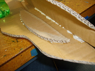
Cardboard Progress 2: "I am starting to dislike this project"
Title says it all.
 |
| the second piece had to be braced on the inside in several places to keep shape |
 |
| Used paper to act as hinge, but its too floppy.... |
 |
| ... I need it to stay open, like this. |
So, I have the claw, now I need to make the elbow and put it on. And I'm probably going to have to brace the claw so it stays where I need it. So much for the moveable claw theory.
Cardboard Progress; "A little harder than I expected"
Ok, maybe i would have preferred the gum-thingies.


After a LONG day of waiting for glue to dry... I have the main part of the claw pieced together! TA DAH! ... And yes, in case you noticed, I wound up making the right claw instead of the original left one... OOPS.....
This is a bit more difficult then I had intended t to be, but at least I haven't had to trash it yet. While I managed to measure everything out to the exact measurements (hooray for good luck), still, the pieces aren't fitting together perfectly. And... there's something printed on the outside of the crab. Oops. Again. However, they are fitting together well enough to not worry too much about it.
Cardboard Nature Studies; "You want me to do WHAT."
Yay, I get the crab claw....
Should be easy enough... ^_^;;
 |
| Initial sketches and observations |
But it's ok!! With the right cutouts, nets, mathematical equations, E = M(C^2) (not really), I can do this! At least I didn't get a gum-thingie!
 |
| a minor miscalculation.... |
 |
| initial plan |
Should be easy enough... ^_^;;
Final Dots and Critiques; "Never Again"
 |
| Final Dots |
For the most part, it seems my dot compositions seemed OK with my group. It was decided I had about half and half of symmetric and asymmetric compositions, so I had that right. They did note, however, that I had many, many compositions that could be considered continuance in comparison to the other three aspects, especially proximity, which they decided I had too few of. Also, several pieces looked very similar to one another, because I had used similar sizes in each of them. Whenever I used a large dot, it was almost always the same size as a large dot in the other compositions, for example. A pattern they noticed is that I left little negative space in most of my compositions, rather than balancing negative and positive space, or leaving a majority of the area as negative space.
As for my final four, they chose three of the ones that were obvious which aspect they were supposed to depict. The Similarity, however was one that had been difficult to sort, but they liked its pattern.
They gave me suggestions for improving each of my final four. For Proximity, I should move the two middle sized dots closer together, and further apart from the others, so it would not be mistaken for similarity. For Continuance, I should make the final two dots after the large middle one curve more. For Closure, I should move all the dots closer together, and center the pattern more carefully. So that you can compare...
 |
| Final Four draft |
I agreed with everything my group said, when they explained why they thought so. Thanks for the help! =)
16 Dots; " I KNEW there was a reason I didn't like dots..."
 |
| 16 Best, Not Sorted |
Four of each: Continuance, Proximity, Closure, Similarity. My tablemates for the most part had an easy time of sorting these, but there were a couple that they had trouble on.
Sunday, September 12, 2010
"A Magnificent Teleporter" . . . Yeah. . . Ok, then. (Series Photos)
"A Magnificent Teleporter Running a Beautiful Truth."
... I think I much preferred the prompt about a refrigerator charging a fox. However, thanks to recent events, I had an idea on what to photograph. But of course, when I'm on my way to the hospital to take the pictures, I see something that might make an even better project. Why can't things just be easy? And so I post both, unsure which is more interesting. Hmm....


... I think I much preferred the prompt about a refrigerator charging a fox. However, thanks to recent events, I had an idea on what to photograph. But of course, when I'm on my way to the hospital to take the pictures, I see something that might make an even better project. Why can't things just be easy? And so I post both, unsure which is more interesting. Hmm....
 |
| The Way To A Hidden Surprise |
 |


 |
| A Truth: Dangerous Transportation |


My nephew, or a car on fire.... Still too hard to choose...
Thursday, September 2, 2010
Sep. 3 Reading Summaries and Lecture: "BACON IS ART!!"
Intro Gestalt:
Gestalt means "entire figure or configuration". Organization is central to all mental activity, and is a reflection of how the brain functions. The whole is understood to be different from the parts. With high organization, a work has good gestalt. With weak organization, a work has weak gestalt. The four aspects of gestalt are:
Gestalt means "entire figure or configuration". Organization is central to all mental activity, and is a reflection of how the brain functions. The whole is understood to be different from the parts. With high organization, a work has good gestalt. With weak organization, a work has weak gestalt. The four aspects of gestalt are:
- Closure - separate elements are placed so that you perceive the design as a whole, rather than as disparate sections.
- Continuance - part of a form overlaps itself or an adjacent form. Your eye is led to follow the dominant form.
- Proximity - distance between the parts comprising a form. Elements that are closer together appear to be related.
- Similarity - helps hold form together. Objects similar in size appear related.
Visual elements interact through. . .
- Position - the placement of an element relative to other elements and/or the frame. i.e. overlapping, touching, not touching.
- Direction - course of movement. Elements placed in parallel directions further similarity, contrasting can create vocal and movement in a composition.
- Space - areas between and around elements can group, separate or emphasize elements, and allow the viewer to better distinguish elements and their roles in a composition.
Elements of compositional interaction are depth and perspective, and visual weight and balance. Depth creates contrast, and helps a form communicate its purpose and meaning. An illusion of depth in 2D art is created with color and value changes, size, overlapping, and perspective. Perspective is created through the use of lines to depict three-dimensional forms on a two-dimensional surface. Visual weight is the sum of a form's components, and is akin to mass and energy. Our perception of visual weight is influenced by variables, such as size and color. Visual balance refers to the degree of equilibrium in a composition. Position is the dominant means of creating balance. Balance can be:
- Symmetrical - can be divided diagonally, vertically, or horizontally and the resulting sides are essentially the same.
- Asymmetrical - can be divided, and the resulting sides are not similar.
Formal Matters:
< --- Form --------------------------------------------------------- Content --->
Form refers to a set of visual elements (formal elements) such as line, scale, shape, size, composition, and color, whose relationships become the form and structure of a work. The means by which one gives substance to an idea.
Content is the meaning, or purpose, of a work.
Formalism vs. Modernism
Formalist works tend to be focused on their formal elements, such as shape, color, or materiality. Often self-referential, rather than portraying a message.
Modernism has the assumption that art history is a progressive movement toward greater purity in each medium.
Abstraction and Abstract
Abstraction is, in the purest sense, begins with reality and draws away from it, revealing the underlying lines and geometric shapes. Think of "abstract" as a verb, that leads to complete abstraction. Think of:
< -- Representative ----------------------------------------------- Abstraction --->
Association
A shape or form that doesn't really look like anything, but reminds us of other things, adds those identities to it. This is called the poetics of meaning.
A Painting's Internal Logic:
Line - most basic mark. Content, depending on what it is made of, the gesture that created it, and where it resides. Occupies and divides space, and thus influences how one reads everything around it.
Color - color : painting :: line : drawing.
Composition - generally thought of as the arrangement of lines and shapes within a pictorial space.
Fields - fields spread out to the edges of the canvas so that the pictorial space becomes a fragment of an imaginary larger field that exists beyond its edges.
A Painting's External Logic:
Edges - can separate the work from the rest of the world, or separate discrete areas of color or shape within a painting. How the artist deals with interior and outer edges affects the reading of the painting.
Scale - refers to both a work's size in relation to the world around it (absolute scale) and to the relation of its parts to one another within the internal logic of the whole (relative scale).
Format - refers to shape and proportion of a pictorial surface.
Mimesis and Improvisation:
Aristotle states that poetry sprang from two causes, 1) a natural instinct for imitation (mimesis), and 2) an instinct for harmony and rhythm. Painting follows these instincts as well. Paintings from the Renaissance era focused on the first instinct, while a modernist painter would focus on the second.
Surface, Gesture, and Process:
Modernist painters use the surface of a painting as a record of the moment of the aesthetic act. When process drives a painter, the painting takes on a voice of its own as it becomes formed.
Surface as Evidence of an Act:
A student can look at a painting, and read how the painting was done. The painter controls how much of the act is left visible and how much is covered up. Visible brush strokes are signifiers of the act of painting.
Painting as Representation:
A painting is an object, a surface with paint, which is also a record of its creation. But if the object is to hide the process and materials in favor of a seamless illusion, do materiality and process become irrelevant when image is all important?
Painting as Presentation:
We can look at the formal structure of a painting on its own terms, not by how well it serves a narrative image.
Principles of Form and Design:
What is Design?:
A good design is the best possible visual expression of the essence of "something", whether this be a message or product, and looks for the best possible way this "something" can be shaped, made, distributed, used, and related to the environment.
The Visual Language:
A designer can work without conscious knowledge of any of the principles, rules, or concepts of design, but a thorough understanding of them would enhance his capability in visual organization.
Interpreting the Visual Language:
There are no obvious laws, and each theorist must come up with his own solutions.
Elements of Design:
- Conceptual elements
- Visual elements
- Relational elements
- Practical elements
Conceptual Elements:
not visible. Do not actually exist, but seem to be present.
- Point - indicates position. no length or width. Does not occupy space.
- Line - a line has length but no width. Position and direction. bound by points, forms border of a plane.
- Plane - Line in motion. length and width, but no thickness. Position and direction. Bound by lines. Defines external limits of volume.
- Volume - Plane in motion. Position in space and bound by planes. Illusory in 2D.
Visual Elements:
Visual elements form the most prominent part of design because they are what we actually see.
- Shape - anything that can be seen has shape, which provides main identification in our perception.
- Size - all shapes have size. Relative, but also measurable.
- Color - shapes are distinguished from surroundings by color.
- Texture - surface characteristics of a shape. May appeal to touch as much as to sight.
Relational Elements:
Governs placement and interrelationship of shapes in a design.
- Direction - depends on how shape is related to observer, to the frame that contains it, or to other shapes nearby.
- Position - judged by shape's relationship to frame or structure.
- Space - Occupied or left blank. Flat or illusory to suggest depth.
- Gravity - Psychological. Heaviness or lightness, stability or instability.
Practical Elements:
Underlie content and extension of design.
- Representation - realistic, stylized, or near-abstract.
- Meaning - conveys a message.
- Function - serves a purpose.
The Frame of Reference:
All of above elements exist within a boundary called a "frame of reference", which marks outer limits a design.
The Picture Plane:
Within the frame, lies the picture plane, the plane surface upon which the design is created.
Form and Structure:
The way form is created, constructed, or organized along with other forms is called "structure".
Intro to Two-Dimensional Design:
Types of form:
- Geometric - regular angles or patterns.
- Organic - fluid in appearance.
Defining Basic Visual Elements:
- Dot - visual expression of a point.
- Line
- Plane - an area outlined by lines. Expression of height or length, and width.
- Volume - illusion of a three-dimensional form on a two-dimensional surface.
Defining Basic Visual Characteristics:
- Size - relative or measured.
- Shape - external outline of a form.
- Texture - in 2D, visual, not tactile.
- Color
Defining Composition:
Composition refers to arrangement of elements and characteristics within a defined area, to be visually pleasing and to convey information and meaning. Composition can emphasize parts of information, reveal relationships among components, and guide interpretation by making some aspects more dominant.
Philosophies of Visual Organization:
Simplicity and Complexity:
Simplicity usually refers to a form with a limited number of simple elements, or a form that is organized so that its message is unambiguous and easily understood. Complexity can reveal richness and subtelties of an idea.
Order and Chaos:
Order can bring clarity and result in a better understanding of purpose. Many apparently chaotic and complex systems possess orderly structures and intent.
Ways of Finding Relationships:
Proportions:
Visually refers to size relationship between parts of a form. Can make a form more visually inviting, enhance functionality and the communication of meaning, and can be used to persuade or create a desired impression.
Finding and Using Proportions:
First reference point in finding and understanding proportions is the human body.
Ways of Directing Understanding:
Attention and Hierarchy:
Attention can be drawn through the use of hierarchy, in which some components or ideas stand out before others when arranged in dominant and subordinate areas. A dominant area is called the "focal point".
Contrast:
Contrats can be achieved through opposing visual elements such as shape, direction, and color. Contrast can attract and maintain attention.
Creating and Organizing Multiple Forms:
Rhythm:
In 2D design, rhythm is the movement from one idea, compositional area, or element to another. It is the result of hierarchy, contrast, and structure, and involves timing and spacing.
Ways of Creating Continuity:
Structure:
Internal parts of a form that support and define its appearance and contribute to conveying its message.
Interview:
Pure abstraction can not coexist with representative work. To have pure abstraction, the artist must completely abandon anything natural or organic in order to gain the most simple, and self-referential results. Once abstracted, the artwork cannot be reverted back to a representative form.
Subscribe to:
Posts (Atom)